We’ve released a new web project which aims to be filled with creative and fun kids activities! The site is a Pinterest style (masonry) layout. With young active kids of my own, I enjoy spending…
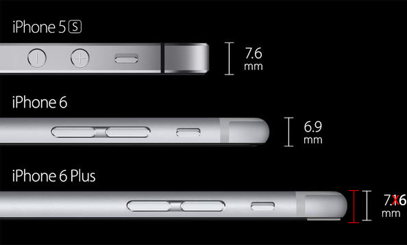
How’s that for keywords in the title?! Hey Apple, I know you’ve been busy with they keynote and all, so I went ahead and fixed the screenshots for your iPhone 6. You forgot to show…
I’ve finished up launching another site that may be of use to those learning Web Design. The site is a training based web design course, which walks students through the entire web design process. We…
I’ve been wanting to rant about this for a while now. Here is my one sentence summary: Why is it that AT&T can pull the bait and switch on millions of customers, and still be…
10th Jun 2015
0 Comments